

By: Luiza Vianna
Data visualization has long been championed as a way to make data more accessible, but to whom? As the name suggests, data visualization relies on visual elements, which can exclude those with visual impairments. Data visualization successfully transforms complex information into digestible messages and allows for the dissemination of new knowledge. As a response to moving data visualization beyond the visual, two alternatives have emerged: data physicalization and sonification.
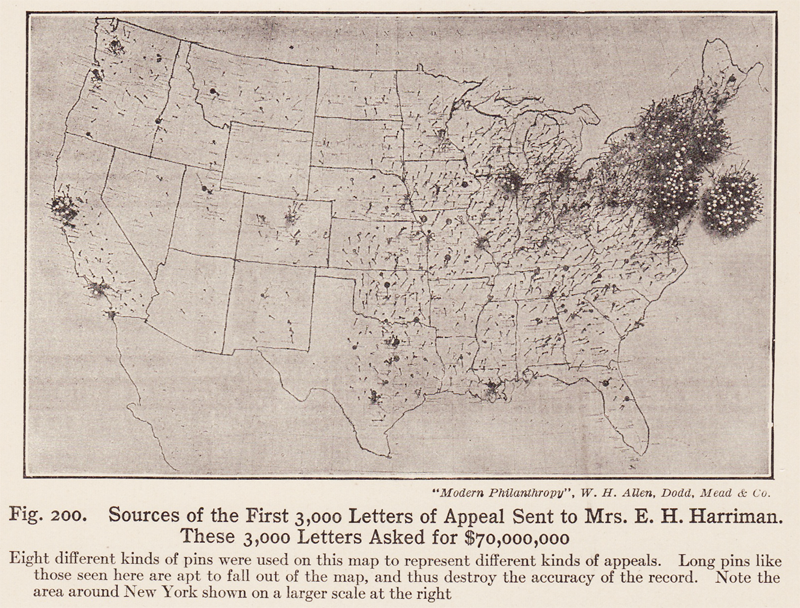
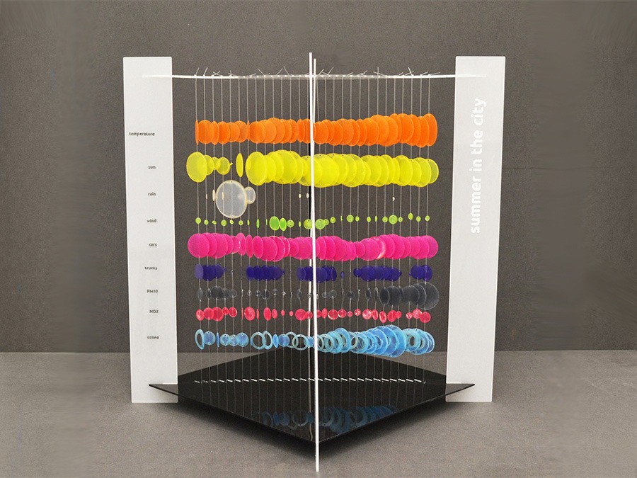
Physicalization can be defined as “how computer-supported, physical representations of data can support cognition, communication, learning, problem solving, and decision making” (Jansen et al., 2015). In simpler terms, it is the action of transforming data into tactile elements - texture, material, shape, height - intended to be handled by observers. Physicalization has existed for centuries, ranging from Mesopotamian clay tokens, early 20th century pin maps, and wire models of factory workers to contemporary traffic flow profiles, molecule models, and dynamic charts. Through haptic perception humans are able to solve data analysis problems with sequential touch and manipulation.
Sonification consists of narrated descriptions or non-speech soundscapes as a way to transmit data, connecting loudness, pitch, timbre or duration to various data parameters. It can be used alone, powered by humans’ ability to compute vast quantities of audio information, or in combination with tactile elements for multimodal experiences. Examples of sonification include pulse oximeters, heart rate monitors, and Geiger counters for radiation detection. Despite its potential, sonification is often regarded as a complement rather than an alternative to visualization, being described as “an emerging discipline that struggles to define its boundaries, its impacts, and shared methods, processes, and tools for the mapping of data to sound” (Lindborg et al., 2023). The space’s lack of barriers, however, leaves room for exploration and experimentation, vying for the optimal use of sound for data communication.
Accessible design has benefits for observers without disabilities as well. Tactile and auditory portrayals can enhance the observer’s experience, evoking deeper understanding than a purely visual representation and allowing for greater learning in shorter amounts of time. Accessible design is universal design. Multisensory depictions of data blur the lines of what data “visualization” means. Like all forms of data depiction, physicalization and sonification creators must be mindful of their designs and structures for audiences’ optimal understanding. Nonetheless, multimodal interpretation is an unconscious, sensory-stimulated part of our everyday lives, powered by mental imagery and individual perspective, so it is counterproductive not to take advantage of it for data design.
References
Bae, S. S., Zheng, C., West, M. E., Do, E. Y.-L., Huron, S., & Szafir, D. A. (2022, April 30–May 5). Making data tangible: A cross-disciplinary design space for data physicalization. Proceedings of the 2022 CHI Conference on Human Factors in Computing Systems (CHI ’22) (pp. 1-18). Association for Computing Machinery. https://doi.org/10.1145/3491102.3501939
Bornmann, L. (2024). The sound of science: Data sonification has emerged as a possible alternative to data visualization. EMBO Reports, 25(9), 3743–3747. https://doi.org/10.1038/s44319-024-00230-6
Dragicevic, P., & Jansen, Y. List of physical visualizations and related artifacts. https://dataphys.org/list/
Herman, B., Jackson, C. D., & Keefe, D. F. (2025). Touching the ground: Evaluating the effectiveness of data physicalizations for spatial data analysis tasks. IEEE Transactions on Visualization and Computer Graphics, 31(1), 875–885. https://doi.org/10.1109/TVCG.2024.3456377
Jansen, Y., Dragicevic, P., Isenberg, P., Alexander, J., Karnik, A., Kildal, J., Subramanian, S., & Hornbæk, K. (2015). Opportunities and challenges for data physicalization. Proceedings of the 33rd Annual ACM Conference on Human Factors in Computing Systems (pp. 3227-3236). Association for Computing Machinery. https://doi.org/10.1145/2702123.2702180
Lindborg, P., Lenzi, S., & Chen, M. (2023). Climate data sonification and visualization: An analysis of topics, aesthetics, and characteristics in 32 recent projects. Frontiers in Psychology, 13, Article 1020102. https://doi.org/10.3389/fpsyg.2022.1020102
Nanay B. (2018). Multimodal mental imagery. Cortex; a journal devoted to the study of the nervous system and behavior, 105, 125–134. https://doi.org/10.1016/j.cortex.2017.07.006

